· Group Facilities and Aggregate Emissions
· Emissions Spatial Calculator
· Geocoding and Place Searching
· Treemap
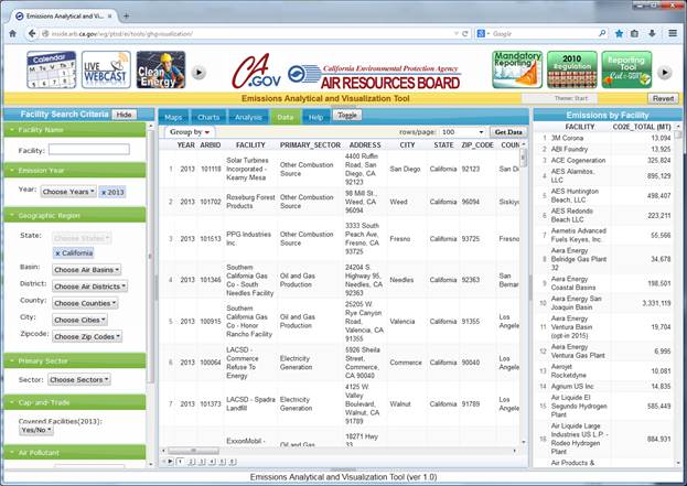
· Graphic User Interface (GUI)
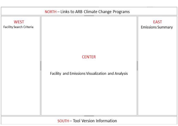
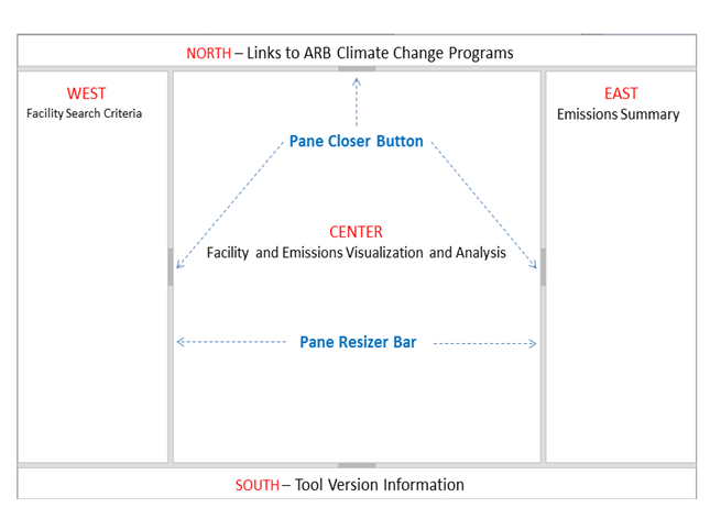
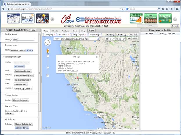
The Graphic User Interface (GUI) consists of five resizable and closable panes: NORTH, SOUTH, WEST, EAST, and CENTER.
To resize a pane, click on a Pane Resizer bar, and drag the bar to a desirable position. To close a pane, click on the Pane Closer button at the center of a Pane Resizing bar.
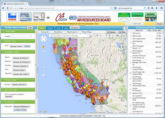
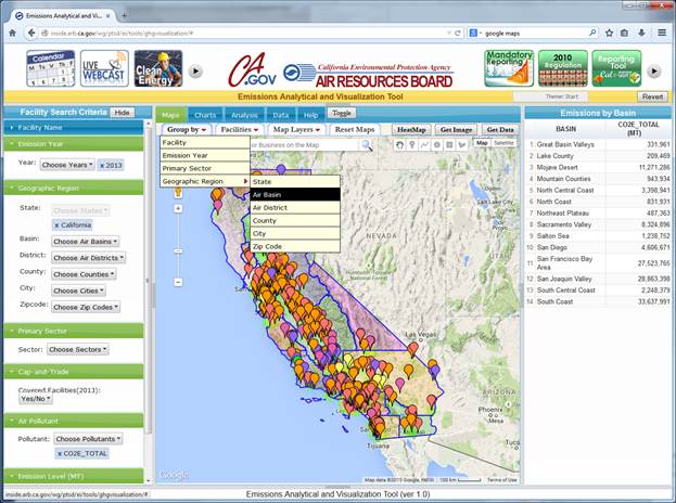
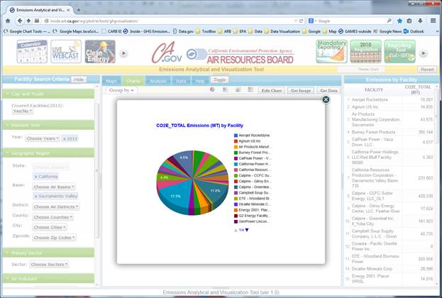
The NORTH pane has an array of graphic icons that links to ARB’s climate change programs and resources. The SOUTH pane displays the version of the web tool. The WEST pane hosts ‘Facility Search Criteria’ options. The EAST pane presents GHG emissions summary data by various group factors. The CENTER pane is designated to visualize and analyze facilities and GHG emissions in mapping, graphic, and tabular formats. It contains the following views: Maps, Charts, and Data. The tool includes a Help tab in the CENTER pane.
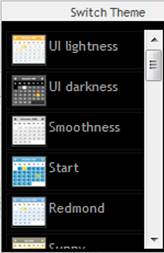
A user can change the GUI color scheme by clicking on the ‘Switch Theme’ button in the upper-right area. Select a color scheme from the dropdown list, colors of panes and tabs will change accordingly. Click on the ‘Revert’ button to reset the color scheme to its default settings.
Users can query facilities and emissions based on one, or any combinations of the following criteria specified in the WEST pane: Facility Name, Emission Year, Geographic Region, Primary Sector, Cap-and-Trade, and Emission Level of the first selected Air Pollutant. Users can open/close facility search criteria categories individually by clicking on a particular category tab, or open/close them together by clicking on the ‘Open’/‘Hide’ toggle button next to the ‘Facility Search Criteria’ title.
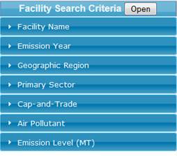
Here are some general rules that apply to the Facility Search Criteria:
· All facility search criteria of different categories work together in generating facility query results;
· Multiple selections are allowed for Emission Year, Geographic Region, Primary Sector, and Air Pollutant. When none selection is entered in a category, the query assumes all possible values in the category;
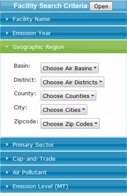
· For the Geographic Region, available choices in lower categories are dictated by selections entered in upper categories. For example, if only ‘SACRAMENTO VALLEY’ is selected in the ‘Basin’, then the drop-down lists for ‘District’, ‘County’, ‘City’ and ‘Zipcode’ are all limited to the regions within the ‘SACRAMENTO VALLEY’ air basin.
· If multiple air pollutants are selected, the Emissions Level selector will only apply to the first air pollutant being selected.
· The tool instantaneously responds to any changes in Facility Search Criteria, and refreshes the data in the CENTER and EAST panes;
· Any changes made in Facility Search Criteria are automatically synchronized among different views of the tool. For example, changes made in Facility Search Criteria at the ‘Maps’ view will also be reflected in the ‘Charts’ and ‘Data’ views when a user switches between views.
Because of these features, the tool offers almost unlimited possibilities to produce customized maps, charts and datasets, making emissions analysis and visualization an easy thing to do.
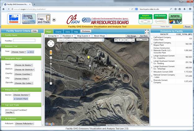
In Maps view, selected facilities are displayed on the map as markers. Selected facilities and associated emissions are also listed on the EAST pane, where users can sort the table by facility names or by emissions. Facilities can be grouped by various factors such as year, sector or geographic boundaries, and aggregated emissions from grouped facilities will be calculated and displayed in the EAST pane. The tool offers an array of spatial calculators to quantify emissions from facilities in the user-defined areas. Multiple map layers are available to overlay on the map, so that facilities and their emissions can be assessed in a broad context. The tool provides additional utilities for exporting maps, downloading data, geocoding addresses, and searching places on the map. The tool leverages the services and functions provided by Google Maps, so that users can obtain the detailed satellite images and street views of facility physical sites.
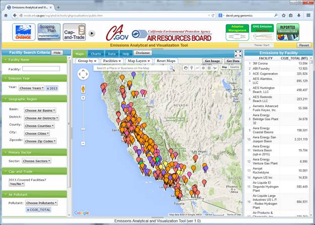
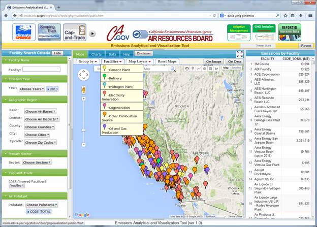
Colors of markers differ by the type of facility. Users can hover the mouse pointer over the ‘Facilities’ tab on top of the map to show a legend of facility markers. If users click on a facility marker from the dropdown list, then markers representing the selected facilities will bounce, making it easy to locate these facilities on the map.
Users can click a facility marker on the map to open the facility information window. Users can also open the facility information window by clicking a facility record on the emission summary table in EAST pane. This operation will also set the facility marker to bounce on the map. The facility and emissions information is grouped into various categories and is presented under separate tabs.
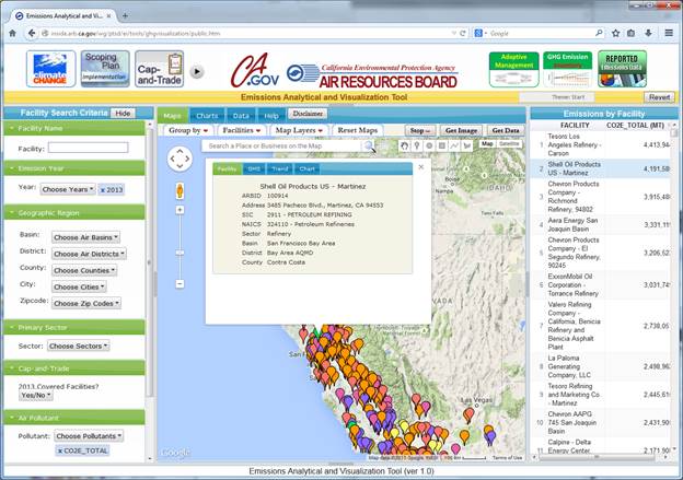
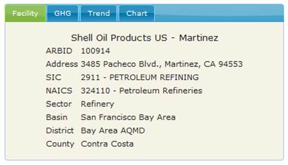
The ‘Facility’ tab contains the facility basic information, such as facility name, ID, address, sector and location.
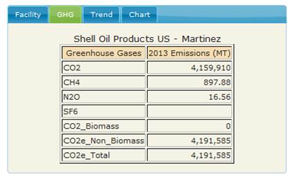
The ‘GHG’ tab lists emissions of greenhouse gases for the selected emission year(s).
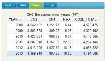
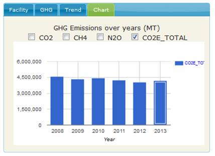
The ‘Trend‘ tab summarizes facility annual GHG emissions over time. GHG emissions for the selected ‘Emissions Year’ are highlighted in the table (Year 2013 is highlighted in the example).
The ‘Chart’ tab presents facility’s GHG emission trends in bar chart format. The bar(s) representing the selected ‘Emissions Year’ is highlighted in the chart (Year 2013 in the following example). Users can compare the emission trends of different pollutants.
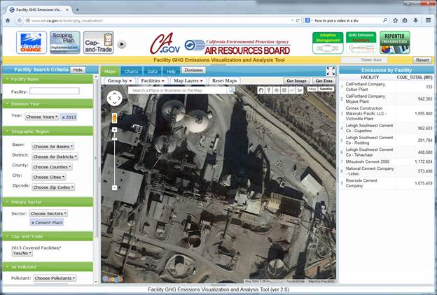
Users can switch Google Maps to the Satellite mode. After rooming in the map, users will see the detailed satellite image of the facility.
![]()
![]()
If rooming in further, users can view the facility from different angles by clicking on the image rotate button.
![]()
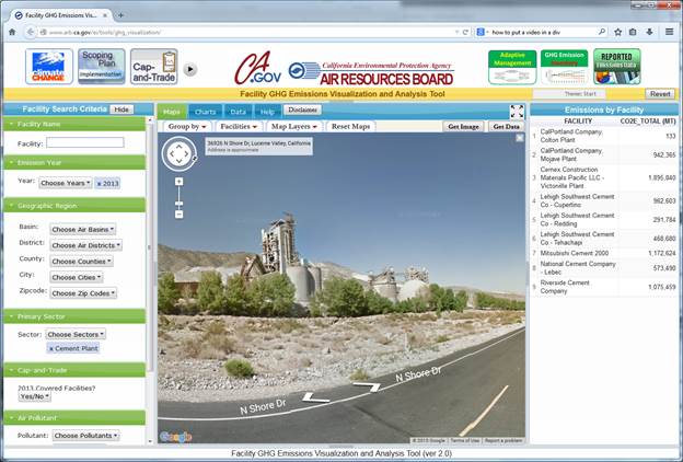
Users can click Street View icon on the map to have a street view of the facility. Users need to click on the Close icon (x) on the upper-right corner to close the Street View.
![]()
Group Facilities and Aggregate Emissions
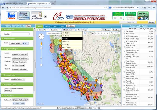
The ‘Group by’ tab provides functions to aggregate emissions by various group factors, such as emission year, primary sector, or geographic region. The emissions summary table is located in EAST pane. The emissions summary table is sortable by the group factor or by the emissions level. The emissions summary table also interacts with the map. When a row in the summary table is clicked, facility markers in the selected category will bounce on the map. In case the group factor is a geographic region, a base map of the geographic boundaries is also loaded onto the map.
Users can load various map layers on the map, and view facilities in the context of various geographic boundaries. The Map Layers dropdown list includes the following options:
§ Air District
§ Air Basin
§ County
§ Zip Code
§ Township
§ Clear Maps
When users click once on a map layer from the Map Layers dropdown list, the map layer is loaded on the Google Maps; click another time on the same map layer, the map layer will be unloaded from the Google Maps. To unload all map layers, click ‘Clear Maps’ on the dropdown list. When facilities and emissions are grouped by a geographic region, the corresponding geographic boundary map will be automatically loaded on the map.
When the ‘Reset Maps’ tab is clicked, the map will be centered at and zoomed to the state of California, and the map type will be reset as the terrain map. This function enables users to jump out quickly from detailed facility level maps to the statewide overview map.
The Drawing toolbar is located at the up-right corner on the map. It contains the following icons for drawing different shapes: point, polyline, circle, rectangle, and polygon. To draw a shape on the map, users need to select a shape from the Drawing toolbar first, and then click on the map to start drawing the shape on the map. Users can draw multiple shapes on the map. Once a shape is drawn, users can color, move, resize, edit, and delete the shape. When a shape on the map is selected, a color palette and a delete button will appear on the up-right corner below the Drawing toolbar. Using the color palette and the delete button, users can change the color of the shape, or remove the shape from the map. When a shape is clicked, an information window will also pop up. The information window contains the location and/or geometry parameters of the shape, such as latitude and longitude, length and area. Users can drag and drop the shape anywhere on the map, or drag and drop some key points on the shape to resize and edit the shape. The location and/or geometry parameters in the information window are updated on fly when the shape is moved, resized or edited.
![]()
![]()
![]()
Except point and polyline, the circle, rectangle, and polygon shapes are primarily for defining customized areas on the map and quantify emissions from facilities within the user-defined areas.
o Point - The point shape is useful for ‘point-and-click’ geocoding on the map. Select the point icon in the Drawing toolbar and click on the map, and then a point marker is created. Click on the marker, and its latitude and longitude will show in the information window. Users can drag & drop the marker anywhere on the map, and the latitude and longitude will be updated simultaneously.
o Polyline - The polyline shape can be used to calculate the distance between two or multiple points on the map. When creating a polyline, double-click to end drawing of the polyline. The information window of the polyline contains latitude and longitude of all click-points on the polyline, and the total length of the polyline. To measure the distance between two points, create a line that starts at one point and ends at the other point.
o Circle - Using the circular shape, users can draw a circle on the map. The tabbed information window of the circle contains geometry parameters of the circle, facilities in the circle, aggregated emissions from these facilities, and GHG emissions trend. The selected Emission Year will be highlighted in Trend and Chart tabs. Users can drag-and-drop the circle to a different location, or change the radius of the circle. The content of the information window will be updated simultaneously.
o Rectangle - Using the rectangular shape, users can draw a rectangle on the map. The tabbed information window of the rectangle contains geometry parameters of the rectangle, facilities in the rectangle, aggregated emissions from these facilities, and GHG emissions trend. The selected Emission Year will be highlighted in Trend and Chart tabs. Users can drag-and-drop the rectangle to a different location, or change the shape of the rectangle. The content of the information window will be updated instantaneously following every shape-editing operation.
o Polygon - Using the polygon shape, users can draw a polygon on the map. The tabbed information window of the polygon contains geometry parameters of the polygon, facilities in the polygon, aggregated emissions from these facilities, and GHG emissions trend. The selected Emission Year will be highlighted in Trend and Chart tabs. Users can drag-and-drop the polygon to a different location, or change the shape of the polygon. The content of the information window will be updated instantly following every the shape-editing operation.
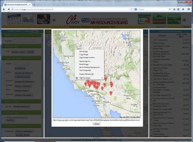
By clicking on the ‘Get Image’ button above the map, users can export the facility map as a static Google Map and then embed the map in other documents. On the bottom of the image is a map URL that can be copy and pasted to any web browsers, or embedded on other web pages. Right-click the static map, a menu will pop up with options to copy or to save the image. Please note that the number of facilities exported to a static map should not exceed 85 facilities. All facilities are represented with a common generic marker on the static map, and all loaded map layers are stripped off when exporting the map.
Geocoding is an operation of finding the latitude and longitude of a place from its address. The reverse-geocoding is a process to estimate the street address of a place from its latitude and longitude. Users can do both regular geocoding and reverse geocoding with the tool using the built-in Place Search toolbar on the map. The Place Search toolbar is located on top of the map, where users can type in an address to be geocoded, or the latitude and longitude for reverse geocoding. Beside of geocoding, users can also search for places or business on the map using this toolbar. When users type in an address or a place name in the toolbar, the auto-completing function is enabled, and users can select the best match from a list of candidates.
![]()
![]()
The geocoding or place search results will be placed on the map as markers of various icons, depending on the type of place or business being searched. The information window will contain the address, latitude and longitude, and possibly phone number and website if the searched place is a business. The Place Searching for businesses only returns results in the current map bounds.
As a result, users can easily search for a facility on the map, either by the facility address or by the facility name. These features, along with the point-and-click geocoding tool in the Drawing toolbar, and the geographic boundary maps in the Map Layers tab, are very useful for checking facility locations.
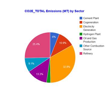
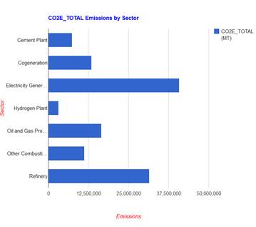
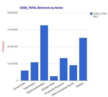
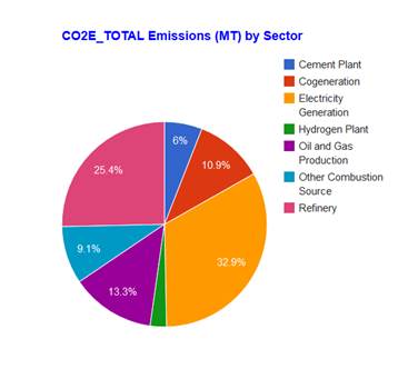
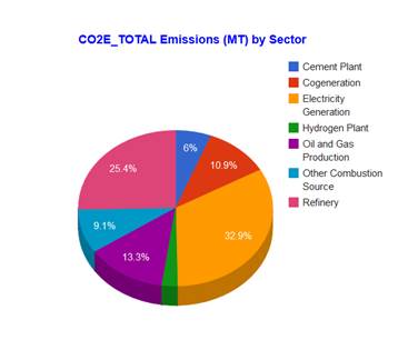
The tool offers the following types of charts to present emissions from individual facilities or aggregated emissions from a group of facilities. The following examples display emissions grouped by industrial sector:
o Pie Chart
o Bar Chart
o Column Chart
o Tree Map
Users can switch between different charts by clicking on the chart icons on top of the chart area. The chart type is preserved when switch between different views. For an example, if you have a bar chart in the Charts view and then switch to the Maps view, it’s still a bar chart when you switch back to the Charts view. All types of charts are sortable, editable, expandable and exportable; and the data used for creating charts are downloadable.
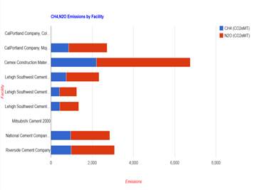
o Sortable - all emissions charts (except treemaps) are sortable based on either category name or emission level. The following charts are sorted by the emission level.
 |
 |
 |
o Expandable – all emissions charts can be drilled down to the next group level, and ultimately to the facility level. For example, if a user clicks on a slice of the above pie chart that represents emissions from cement sector, a new pie chart will be created to display emissions from individual cement plants.
o Exportable - all emissions charts (except treemaps) can be exported and embedded in other documents or webpages.
o Downloadable – the data used to create the emissions charts can be download as comer separated values, or csv files.
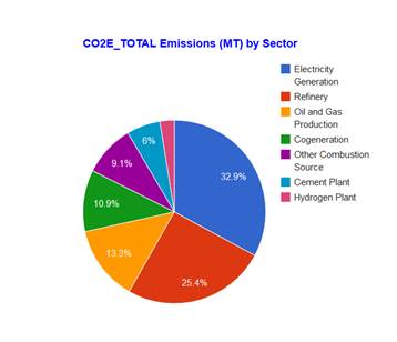
Pie Chart is the default chart when a user switches from other views to the Charts view for the first time of the user session. Users can click on the pie chart icon to toggle between 2-dimentional and 3-dimentiondal pie charts. If more than one air pollutants are selected, only the emissions of the first selected air pollutant are used for creating the pie chart. Emissions of non-CO2 greenhouse gases are converted to CO2e metric tons on the pie chart and in the emissions summary table. When a row is clicked in the emissions summary table, the corresponding slice in the pie chart will be highlighted. When a column header is clicked in the emissions summary table, both the table and the chart will be sorted based on the clicked column.
 |
 |
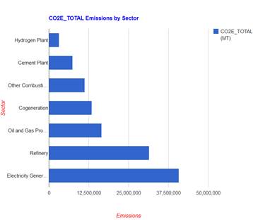
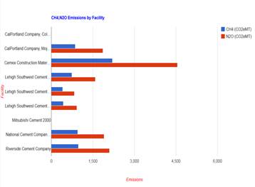
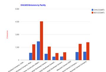
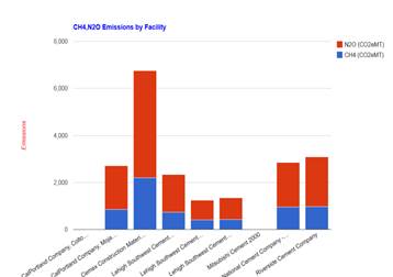
When more than one air pollutants are selected, emissions of all selected air pollutants will be plotted on the bar chart. Users can click on the bar chart icon to toggle between stacked and arrayed bar charts. Emissions of non-CO2 greenhouse gases are converted to CO2e metric tons on the bar chart and in the emissions summary table for easy comparison. The scale of the bar chart might be dominated by the pollutant with the largest emissions so that the emissions of other pollutants are sometimes barely noticeable on the bar chart. When a row is clicked in the emissions summary table, the corresponding bar in the bar chart will be highlighted. When a column header is clicked in the emissions summary table, both the table and the bar chart will be sorted based on the clicked column.
 |
 |
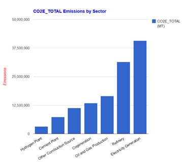
When more than one air pollutants are selected, emissions of all selected air pollutants will be plotted on the column chart. Users can click on the column chart icon to toggle between stacked and arrayed column charts. Emissions of non-CO2 greenhouse gases are converted to CO2e metric tons on the bar chart and in the emissions summary table for easy comparison. The scale of the column chart might be dominated by the pollutant with large emissions so that the emissions of other pollutants are barely noticeable on the column chart. When a row is clicked in the emissions summary table, the corresponding bar in the column chart will be highlighted. When a column header is clicked in the emissions summary table, both the table and the column chart will be sorted based on the clicked column.
 |
 |
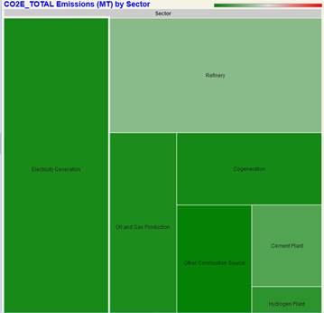
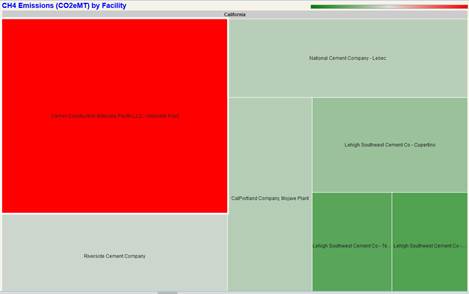
In a treemap, emissions are represented with rectangles of various sizes and colors. The size of a rectangle is directly proportional to the emissions of the entity it represents. The color of a rectangle changes from green to red as the emissions increase. Users can hover the mouse over a rectangle, and the information of the entity represented by the rectangle will pop up.
The Data view hosts a data table that contains the detailed facility information and their emissions data. As the data table might contain many rows and columns, both vertical and horizontal scroll bars are available when necessary. No paging is the default setting for the data table, but users can reset the number of rows in a page from the ‘row/page’ dropdown list. In case multiple pages are needed to accommodate all records, then the page navigation bar appears at the bottom of the data table. The data are sortable by any column. Click on a table header to sort the table in either ascending or descending orders. Users can download the data as a csv file by clicking on the ‘Get Data’ button above the data table.
![]()
![]()
![]()
![]()
The emissions summary table resides in the EAST pane of the GUI. The table contains aggregated emissions by various group factors. The default group factor is by facility. Users can choose a different group factor to aggregate emissions by clicking on the ‘Group by’ dropdown list on top of the CENTER pane. The ‘Group by’ function is available from all views in the CERTER pane, including Maps, Charts, and Data views.
The emissions summary table aggregates emissions of all selected pollutants from the filtered facilities, and it responds instantaneously to any changes made on the ‘Facility Search Criteria’ in the WEST pane. The emissions summary table is sortable by either the group factor name, or by emissions. Users can click on the table headers to sort the table in either ascending or descending orders.
The emissions summary table also interacts with the facility maps and emissions charts in the CERNTER pane. In the Maps view, click a row in the emissions summary table will result in the bouncing facility markers that correspond to the clicked row. In the Charts view, click a row in the emissions summary table will result in a highlighted chart element that represents the emissions from the selected row. In the Charts view, the chart will be sorted when the emissions summary table is sorted.